Overview
Extensiv provides third party logistics and warehouse management software for thousands of warehouses around the world. One of the main functions of these warehouses is to pick and fulfill orders with a good deal of speed and accuracy. We discovered that our key feature to support this need, Smart Scan, was antiquated and was a big pain point for our users and failed to provide neither speed or accuracy. I was tasked to research this issue and provide the UX/UI direction for this feature in an effort to create a faster, more intuitive interface that would no longer be the bottle neck for processing orders and would validate the accuracy of the pick.
“It just sucks”
The initial issue was stated very vaguely and often provided no information other than it is “too slow” or “it just sucks”. I was able to clarify the issue and narrow it down to three different issues:
The interface, while providing most of the data the user needed to perform their task, was intended as a data display interface only and was organized in a way that made it difficult for users to clearly identify the information they needed. This was partially due to the hardware this data was viewed on as well as a general lack of thoughtful organization of that data.
Pick accuracy was not something that was considered in the original design beyond providing accurate information to work from. There was no attempt to validate the pick was correct. Beyond this, there was no accountability or record of the pick to compare against if a variance was discovered.
Hardware performance was the final issue. While this was clearly not a design issue, the lack of performance had a massive impact on the overall experience, often rendering the feature unusable. This had to be addressed to provide my users with a fantastic experience.
The goal was to provide a more user friendly interface that supported best practices within the warehouse, considered the environmental constraints, and performed at a level that would keep up with the efficiency of the warehouse employees, and did all of this with a high level of accuracy.
My Target Audience
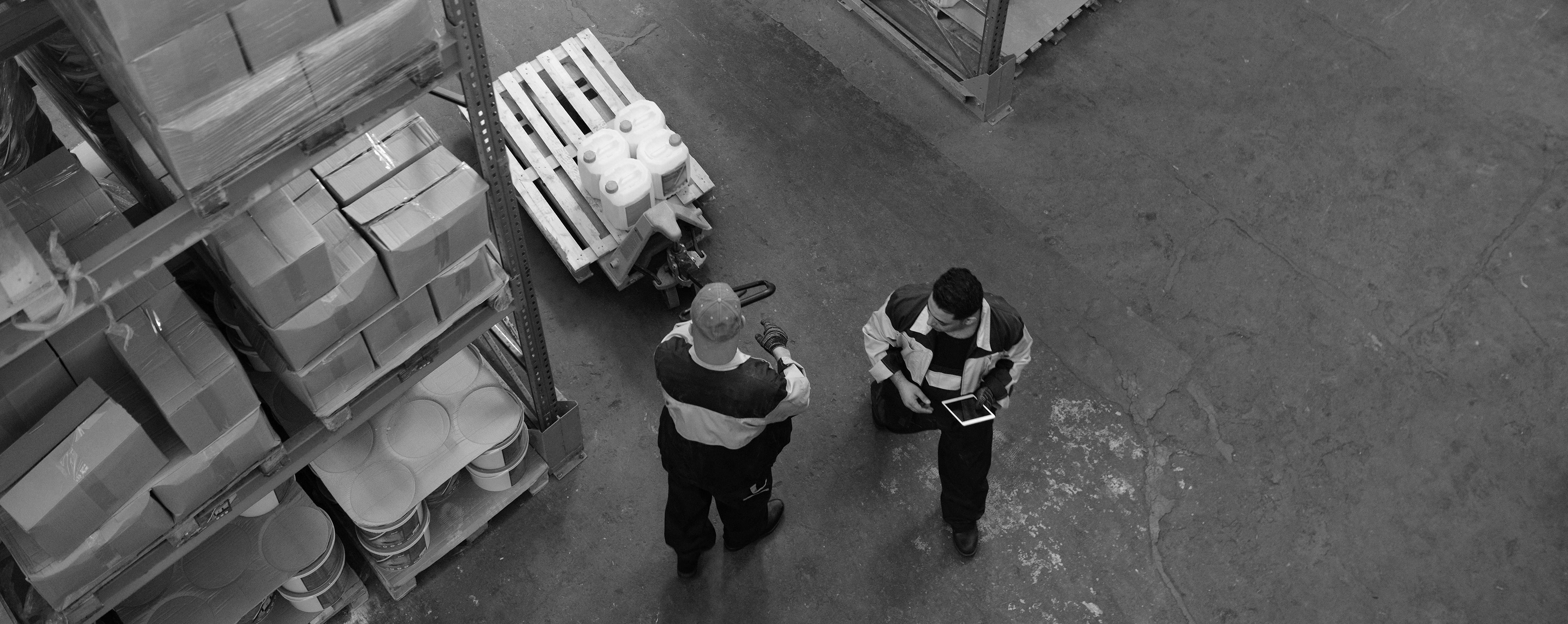
The primary persona for this feature are the workers on the warehouse floor. They are the ones who directly interact with the equipment (scan guns, consumer devices, even small desktop workstations). They are the users who will be most impacted if the software fails and, they are the ones who can define the best practices and workflows that I needed to understand to design the right tool for the job.
The secondary persona for this initiative is the warehouse manager. They would typically be the decision makers for using this tech and approving its use within the warehouse. My goal here was to build a level of trust in the product via the warehouse floor workers and their response to the feature.
The third persona for this initiative is the tech support or IT department employee who will be tasked with configuring the system. The primary goal for this persona was to make this as seamless as possible with as little configuration needed while allowing enough customization to tailor the process to their specific warehouse procedures.
My Team
In this instance our team consisted of the following:
UX/UI Designer - This role was fulfilled entirely by myself. At this point the company was fairly small and I was the primary UX/UI designer and reported directly to the CTO. My role was to facilitate any discovery (video calls, warehouse visits, prototypes, testing, etc…). I was also responsible to aggregate the data from the discovery sessions to build workflows, wireframes, and ultimately an interactive prototype to test with potential users.
Product Manager - I partnered with our product manager who oversaw the flagship product, 3PL Central, which included Smart Scan, the feature I was working on improving. This was a critical piece as Smart Scan relies heavily on data and input from 3PL Central. The product manager was responsible for coordinating development and would act as a liaison between myself and the engineers during the build.
Engineering Lead - This person provided me with insight into our tech stack and it’s limitations/abilities. They also critical in helping us identify the performance aspect of this initiative.
Subject Matter Experts - These are internal employees, often former warehouse employees, who have a deeper understanding of logistics and warehouse management. They are there to provide information regarding the use cases and to help me prepare for external testing.
External Users - This is a roster of 6-8 unique users across our customer base. These users were asked to provide details on their processes, often sharing via video conference or in person visits. They also provided honest and direct feedback to myself to help me determine if the decisions I made were effectively achieving my goals.
Roadblocks
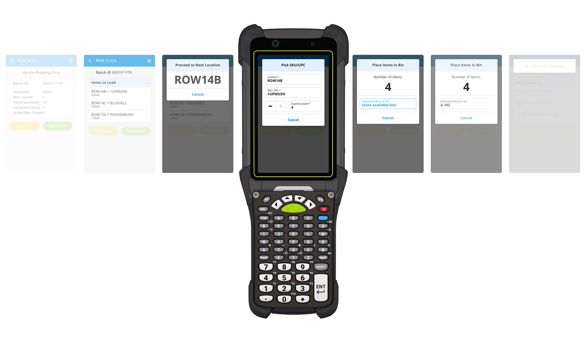
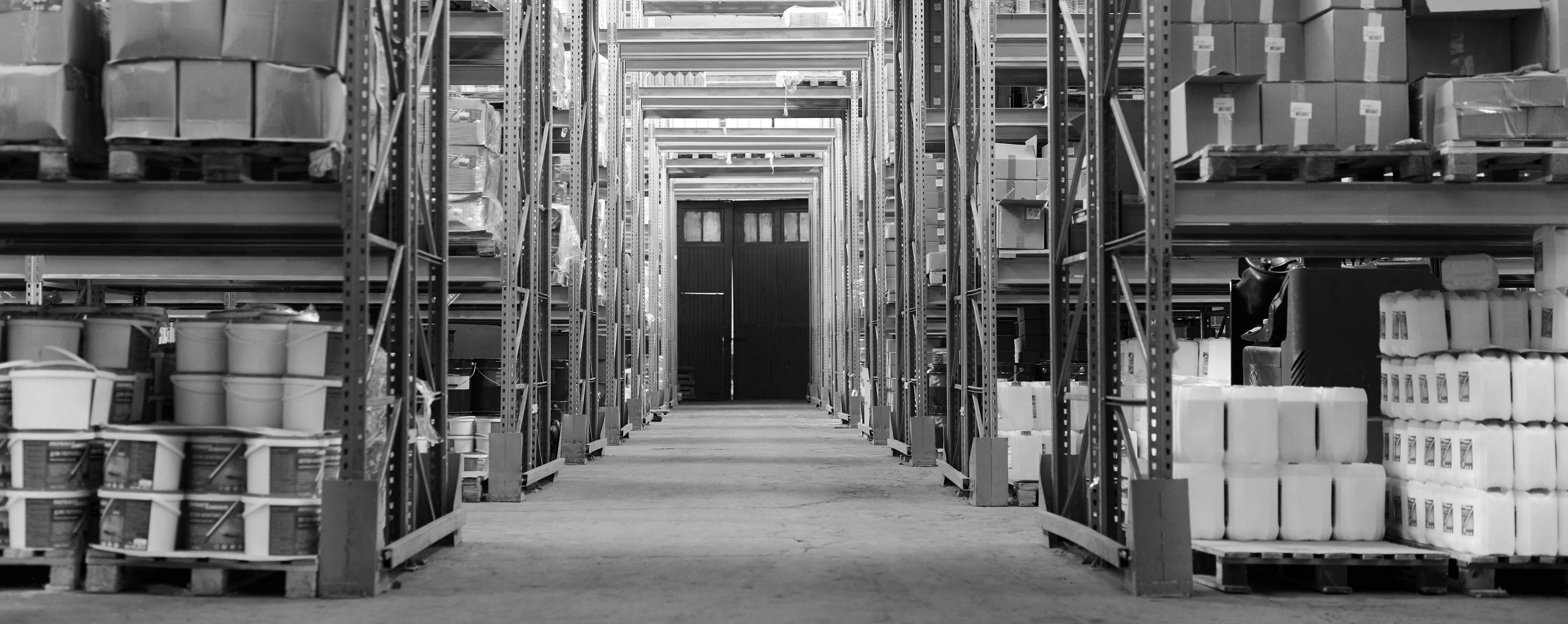
Smart Scan is an incredibly useful tool designed to be deployed on purpose built scanning devices that are designed to work in the harsh conditions that exist in the warehouses. It also supports a desktop view as well as consumer devices like a smartphone or tablet. The primary goal was to cater toward the purpose built scanning devices.
While these devices are robust, powerful tools that excel in scanning performance, damage resistance, and even have built in hard keys for various functions, their touch screens are small, very low quality, and don’t perform anywhere near what we expect from our daily devices. All of this had to be taken into consideration as I designed the workflow and interface.
The tech side of the equation that was impacting performance was all essentially behind the scenes and it became apparent that I was only going to be able to inform our engineers of the specific issues and what the expected behavior should be.
The scope of this kept me confined only to the pick process however, while reviewing the entire Smart Scan application, I determined I needed to design with a forward thought to how this might be used or effect other parts of Smart Scan.
Plan of Attack
My approach to this initiative was to be very customer centric. There was no way I would earn the trust from the warehouse manager and tech support to implement this tool if I couldn’t “win” the floor workers confidence in the product. With this in mind I went immediately into the discovery process.
I started with familiarizing myself with the feature, as well as I could without being in a warehouse environment. Once I had a decent understanding of the feature and how it functioned from a purely green point of view, I enlisted the help of the product manager and the internal subject matter experts.
These experts in our software were critical in helping me get to a point where I understood the use cases and how this tool was meant to be used. It also helped me start to extract themes regarding good and bad aspects to the feature. By the end of the subject matter expert session, I felt I had a decent idea of where the pain points were and was ready to setup external usability testing sessions with actual users of the product.
I worked with our customer service team to get a list of potential testing partners and proceeded to reach out to these customers. The response was overwhelming and I immediately had my roster of eight test subjects. This consisted of visits to warehouses in California, Florida, Minnesota, and Texas. I was fortunate to be able to perform all of these testing sessions in person. This was eye opening and really clarified how incredibly bad our product was in it’s current state. Processes were constantly having to be paused, restarted, or even abandoned due to the poor user experience. This raised the level of urgency in my mind and I was excited to get to work proposing solutions to the issues.
I first addressed the performance issues because this was happening in parallel to my interface design. I was able to illustrate the issues clearly to our engineering team and help them test as they worked to resolve some database issues that were at the root of the problem. This helped us prepare the supporting tech to handle the changes I was proposing on the interface side of the problem.
I then jumped into some process research to see what, if any, industry standards existed for this workflow. What I discovered is the concept that already existed wasn’t necessarily bad, just implemented in a dated, wildly inefficient manner. It also required my users to be very knowledgeable about the software in order to find the information they needed. This was a huge pain point for my users because there is a fairly high turnover rate for floor workers and getting to that level of expertise was challenging. The simplified version of my plan of attack was to do these three things:
Significantly increase the level of automation. This meant to allow the system to validate and advance automatically as the user scanned items for the transaction they are working on. It also needed to be smart enough to give audible and visual cues as to what to do next.
Remove the need to touch the screen as much as possible. As mentioned in the previous bullet point, I automated as much as I could but this required the system to be designed in a logical manner that was clear to the user that all they were required to do was to point and scan. Assuming there were no errors, the system would automatically move to the next step.
Eliminate the guess work or required interpretation of transaction data. The system had to accommodate an ever changing list of requirements for a pick and clearly state to the user what those needs are, and if they achieved the requirements with each pick/scan. Accuracy is an absolute must in warehouses and this was a critical feature.
Allow the tool to guide the user in a simple, intuitive manner. One of the major changes to the interface was to provide an almost “wizard” like interface in contrast to the static UI that currently existed. Much like you encounter setting up software or configuring a system, the user was presented with the current task at hand only and after they achieved that task, they were directed to the next step, quite literally in many cases (“Proceed from location A to location B for your next pick”).
Essentially, I wanted to make it so a new employee could literally pick up the device and start picking orders with little to no direction from another user. I was able to achieve this through a few iterations of the prototype, additional user testing sessions, and ultimately releasing a beta to a cohort of users who provided additional feedback. Anytime I discovered any friction in the process, I worked to eliminate it. This iterative approach helped me dial in the workflow and supporting interface.
“We love it!”
The outcome was very well received. I knew I had a good solution in place after the initial prototype user testing sessions. The response was overwhelmingly positive and I only had to make a series of minor adjustments to the workflow during the subsequent iterations and beta release. The final product was very user centric and catered directly to the needs of the floor workers. It was simple to use with language that anyone could understand, not just seasoned warehouse workers. It was simple and intuitive enough that I was able to give the prototype to non-warehouse employees for testing and they were able to tell me exactly what was happening, what the intent was, and what the expected outcome of each step was without requiring any prompts. Ultimately, I was able to replace the clunky, static, poorly organized, and outdated interface with a slick new, guided tool that did nearly all of the thinking for you. The information was now provided in an actionable format that was automated and easy to use. The performance issues were resolved as part of this release and I felt confident we had an absolute win with this project.
During this process I discovered warehouse workers to be very set in their ways and that added to the challenge of trying to dictate their workflow. I found that when presented with a workflow that was exceedingly simple to follow and coupled that with an interface that removed the guess work and friction they had previously encountered, they were keen to adopt this new platform.
Additional things I learned, and stored away for future projects, was that the warehouse environment is challenging. Old equipment, poor lighting, bad hardware, dirty and dust, lack of processes, lack of quality control, vastly different products and requirements makes for a tough industry to design for. I feel confident though that having this as one of my initial projects with Extensive allowed me to have a better appreciation for what our users are dealing with and has helped me empathize with them as we’ve worked together to implement other new features and fixes.
Some key benefits that were evident after the design was tested and released were:
Improved efficiency. The increased usage of the scan hardware for data entry made it much easier for users to identify, scan, and move on to the next item. This increase in efficiency was easily measurable and obvious despite the extra steps that were added for accuracy.
Improved accuracy. Now that the system provided a higher level of detail and, required the user to scan these details into the pick, we were able to significantly increase the level of accuracy. The new requirements added additional steps but, were implemented in a way that allowed the users to breeze right through the process much faster than before.
Highly intuitive UI. The new UI behaved less like a static spreadsheet and instead became a guide to walk the user through the process. The way this was designed allowed users to operate at any pace so as they got more and more familiar, and subsequently faster using the feature, they were not slowed down by the system and its required steps.
This project occurred several years ago and to this day Smart Scan remains one of the most highly user rated features within our product suite and is a strong selling point for potential customers. It should also be noted that this workflow worked so well that it has been adapted to other features and aspects of our mobile product. It is now used for warehouse audits, receiving, moving inventory, and more.